A UX Case Study and Redesign of Papa John’s Checkout

I reached out to my colleagues recently to hear their stories of poor user experiences online. Needless to say I was soon swamped with a whole host of links from different corners of the internet, but one stood out in particular for a whole host of reasons, which will soon become clear!
The web page in question was the first step of Papa John's pizza delivery checkout, perhaps unsurprisingly in our office given the regular pizza orders!
When you consider Papa Johns annual turnover in the UK of £95,000,000, a large slice (sorry!) of which will come from online orders, and the fact that on average 69% of ecommerce users abandon their carts after adding an item to them, it’s safe to say there are potentially millions of pounds being lost from their sub-par checkout experience.
Project Brief
All projects need to start with some kind of brief. Here’s how I defined this:
Complete a full redesign of the page in order to reduce friction and increase the percentage of users that checkout successfully.
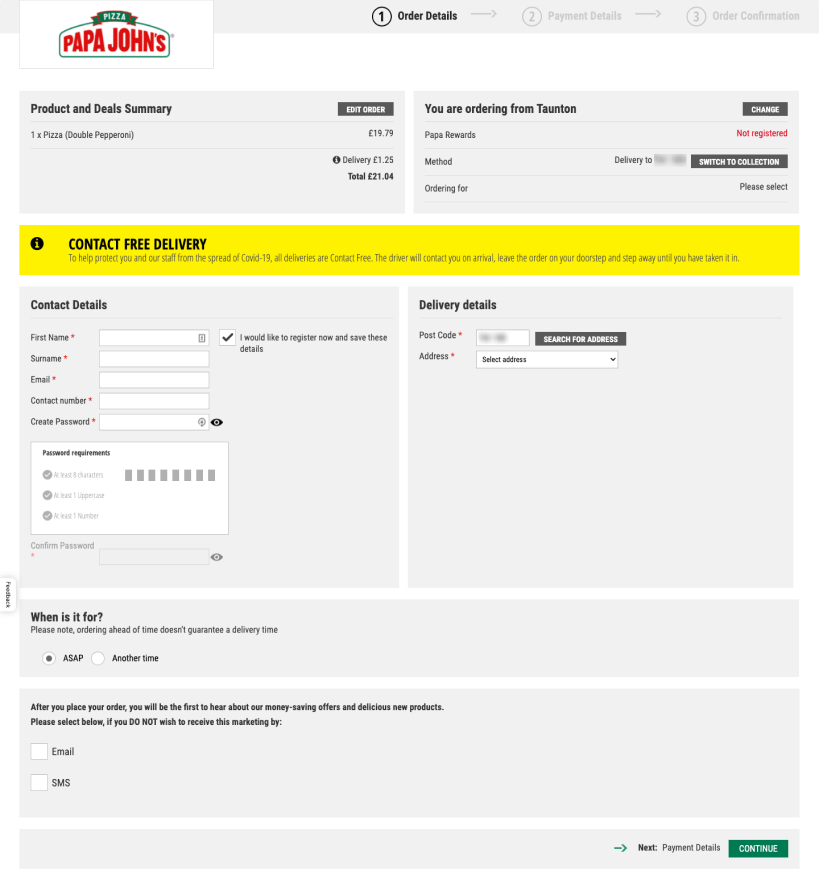
Papa Johns Current Checkout
Analysing the current page
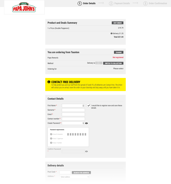
Lack of hierarchy and structure
Ahhh! Lots of grey boxes! Where do I look!? My eye is being drawn to the yellow box in the middle of the screen but it just contains an extra informational message rather than being the most important element on the page.

Too many form fields and poor grouping
Research shows most checkouts can achieve a 20-60% reduction in the number of form fields displayed by default, and that's definitely the case here.
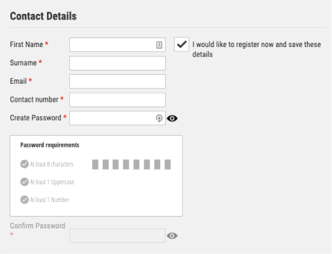
The option to register for an account is enabled by default, making the form appear more complex that it needs to be.
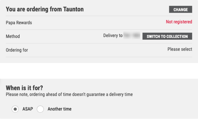
There are two seperate rows of data to explain the delivery method and location, which could easily be more succinct.

The marketing question is worded in a misleading way for the user, a dark pattern found on lots of sites unfortunately. This could also lead to GDPR trouble as guidelines state that consumers should opt-in to marketing communicatiions rather than opting out as they are doing here.

No attention to detail
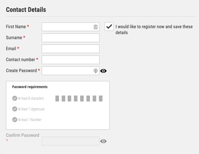
The Confirm Password label doesn’t align with its input field.

‘Ordering for’ in the top right box isn’t clickable, what does this mean and how do I select an option?

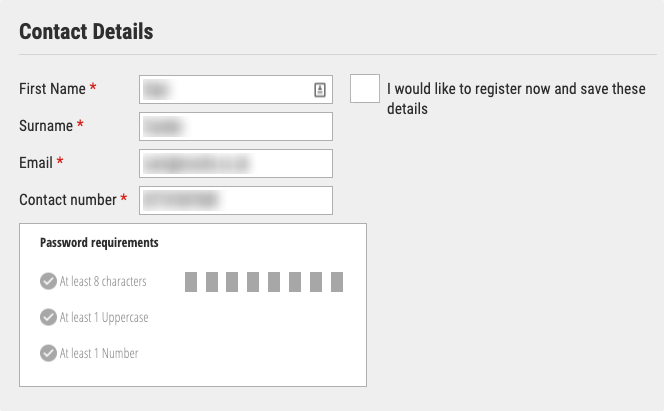
Unticking the ‘I would like to register’ box hides the password field but not the password requirements box! So even if there is no password field to fill out, it still tells you how strong it will be.
Fixing the issues
Introducing a clear flow to the page
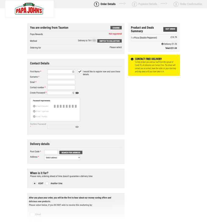
I’ll start by simply moving all of the boxes into one column and centralising them.
Now that’s been done, it’s clear a few of the boxes don’t have any inputs and so don’t need to be part of the main form flow. By moving the Summary and Contact Free Delivery boxes out to a right hand sidebar, we are left with just the boxes that require interaction as part of the main flow.

Simplifying order details
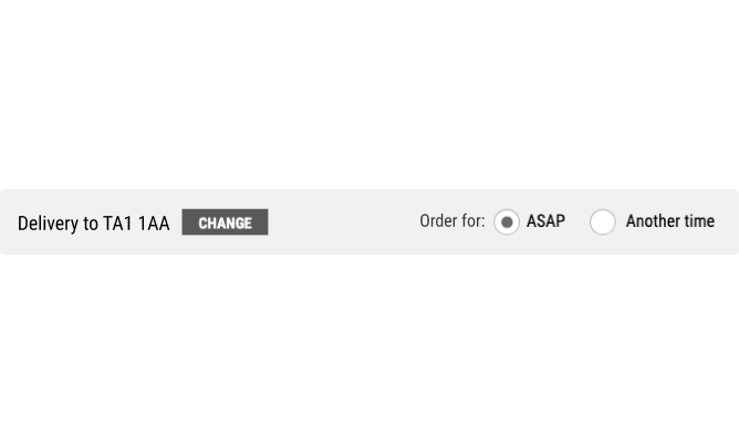
The two delivery location rows can be consolidated into one without getting rid of any useful information for the customer, which is a much clearer and space efficient solution.
As an unregistered customer, the ‘Papa Rewards’ row doesn’t add any value or even provide me with a way to learn more or sell the benefits of it, so I’m going to drop it from my design.
There is also a row ambiguously labelled ‘Ordering for’...is it asking me whether I’m ordering for myself or another person, or maybe ordering for a certain time? The ‘Please Select’ text isn’t clickable so I have no way of finding out!
It turns out it’s related to the time of your order, but I only discovered this when I moved onto the next page of the process. It makes sense to combine it with the form fields from further down the page that actually ask this question.
Applying progressive disclosure to the form
The register checkbox is ticked by default, meaning the form looks more complex than it needs to be for the majority of users who will be trying to checkout quickly and not interested in making an account.
It’s far more effective to apply the principle of Progressive Disclosure, and hide extra fields/information from users until they have indicated they would like to complete them, so I’ll keep this option disabled by default instead.
Hiding extra fields from users until they have indicated they would like to complete them makes forms simpler.
The worst part is, even when you untick the option to register for an account and it sensibly hides the password fields which are no longer relevant, it doesn’t hide the password requirements box!
I can’t think of a reason a surname would be essential to submit a pizza order, so I’ll make that an optional field, and let’s use the space to the right of the Contact Details heading for the registration checkbox.
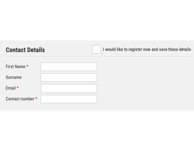
We’re now left with a much clearer and simpler form, but the overall feel is still extremely dull and the general greyness is draining all of the excitement I had about ordering a pizza… time to breathe some life into the UI!
First, here’s a before/after comparison of all the changes we’ve made so far.

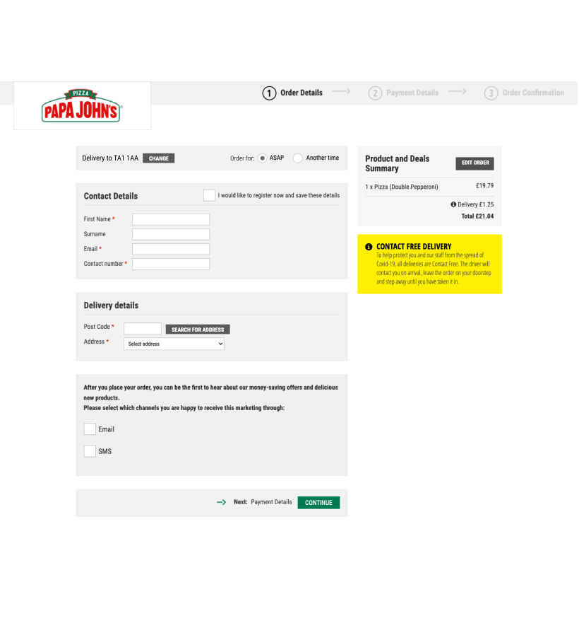
Enhancing the UI
Giving the header some life
Progress bars have their place and can be useful, but for what is a two step process, I’d argue it isn’t needed here and adds unnecessary clutter.
Looking at the rest of the Papa Johns site, diagonal lines are evidently a strong feature of their brand, so I decided to pair that with an image behind their logo.
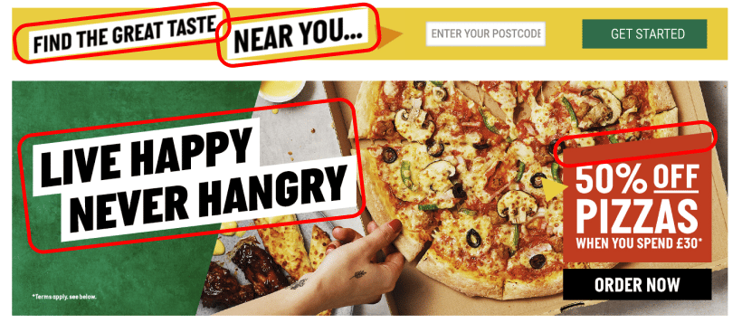
Examples of diagonal lines from the Papa Johns Homepage
It’s a simple change but it instantly lifts the page and will hopefully remind the user it’s worth getting through the checkout to be rewarded with a pizza like that!


Small details add up
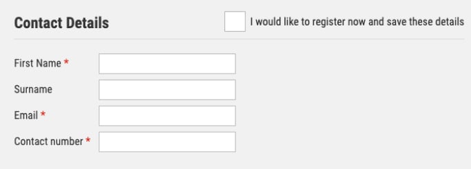
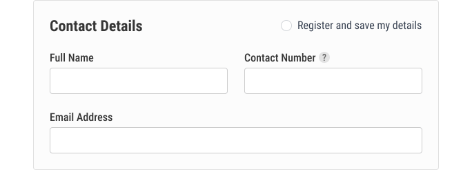
It’s amazing how big of an effect tweaking small details like background colours, corner radius, fonts, borders can have cumulatively, and comparing the Contact boxes is a good example of this. Slightly rounded corners, a lighter shade of background grey with a subtly darker border colour all do wonders to improve this.
Rather than having an asterisk next to 3 of the 4 inputs, I’ve flipped this and just given the only optional field a text label, reducing the visual clutter and making the meaning more obvious. I also opted to switch the form layout to 2 columns, reducing the height of it.
The end result feels much cleaner.
Suitable use of colour for the type of message
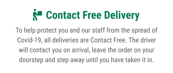
The Contact Free Delivery message should serve as a gentle reminder to customers that it will be a safe delivery, so I’ve used their brand green colour to highlight the title and got rid of the alarming bright yellow colour that was used for the background previously. Doing so also reduces its place within the hierarchy of the page, suitably reducing it to a secondary element.

“Users often perceive aesthetically pleasing design as design that’s more usable.”
Summary
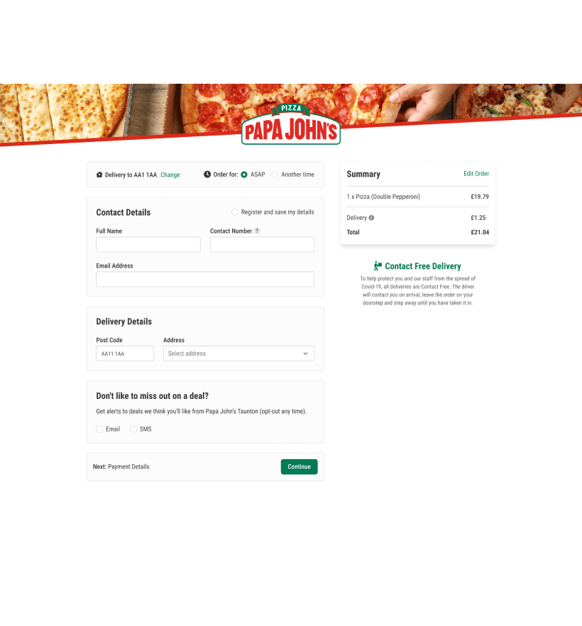
Our work is done! Here’s the final before/after comparison.


Papa, let us know if we can help you optimise your checkout experience, we’d love to help and will accept payment in pizza!


